
6 tips for screen printing fabric for garments
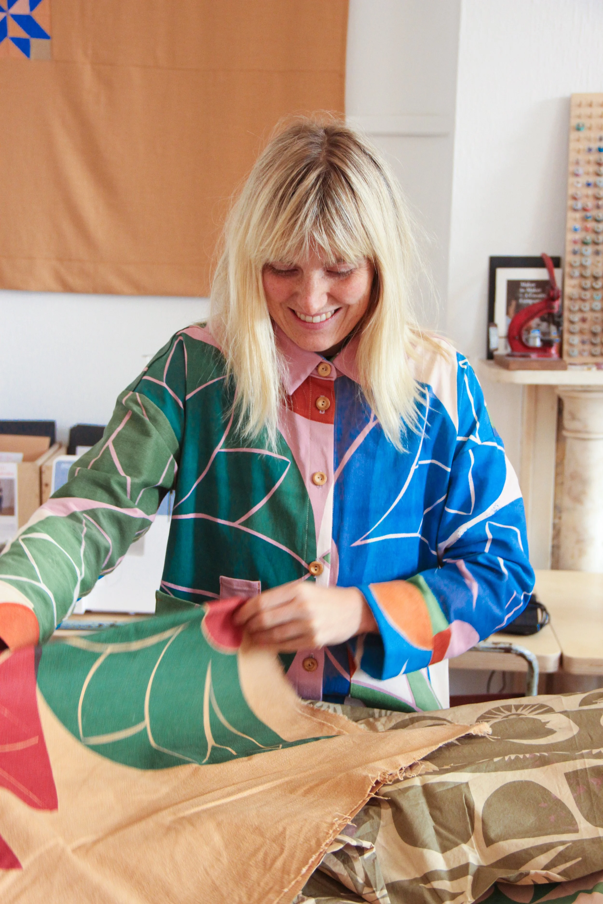
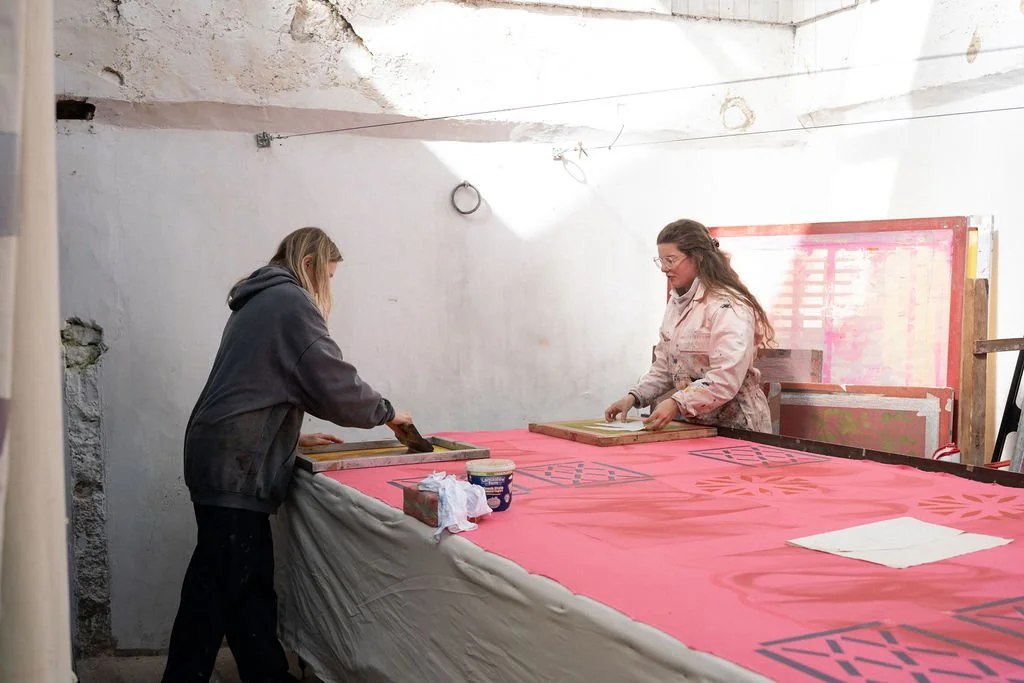
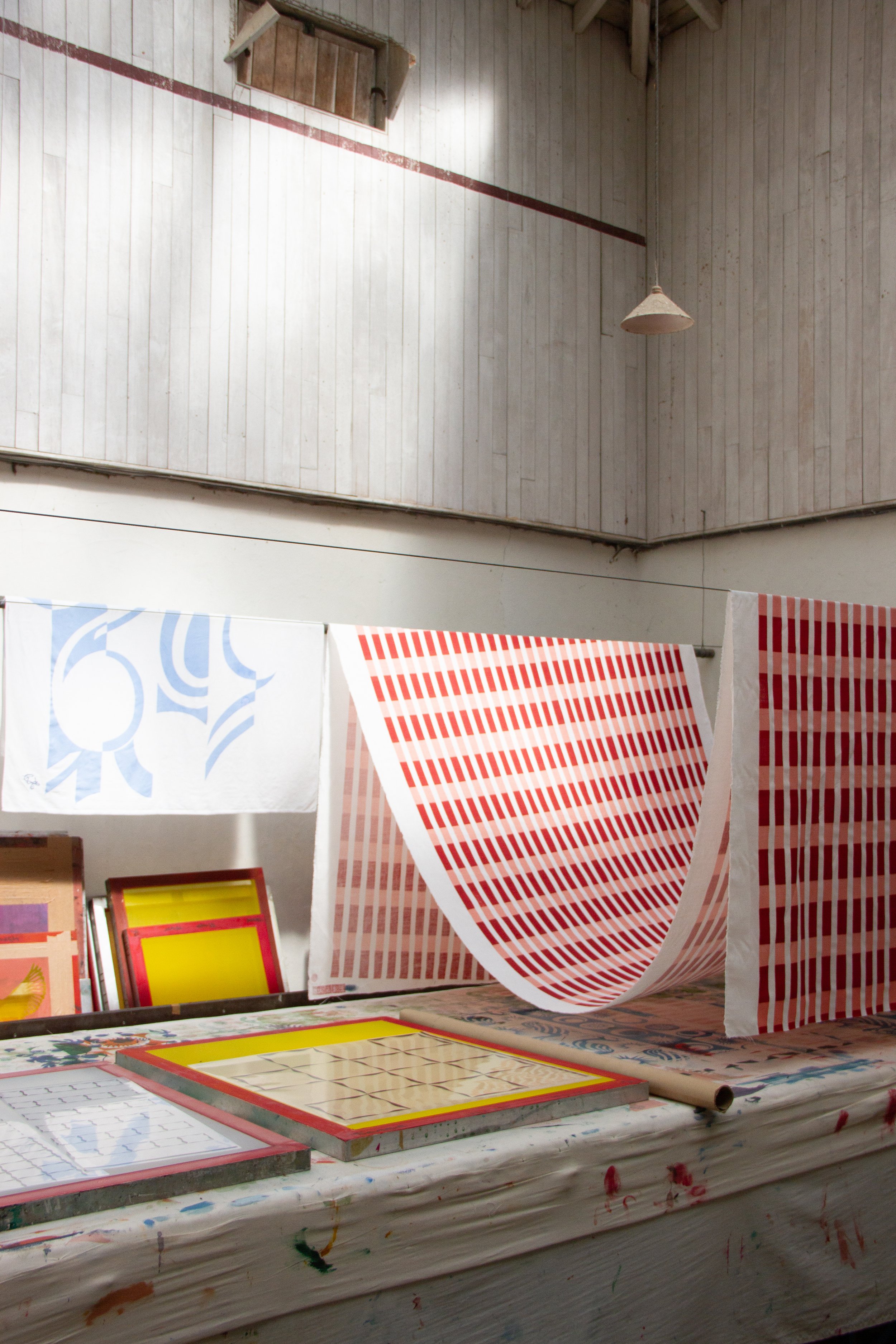
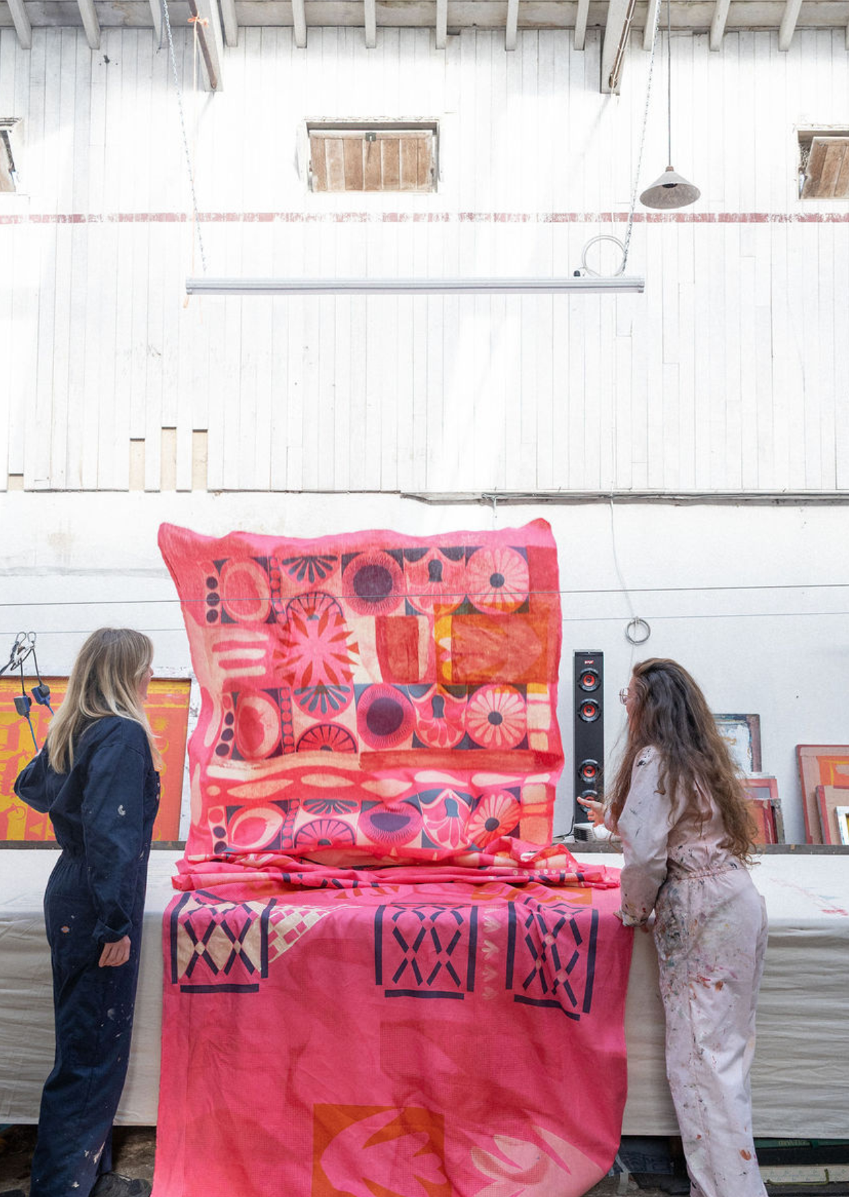
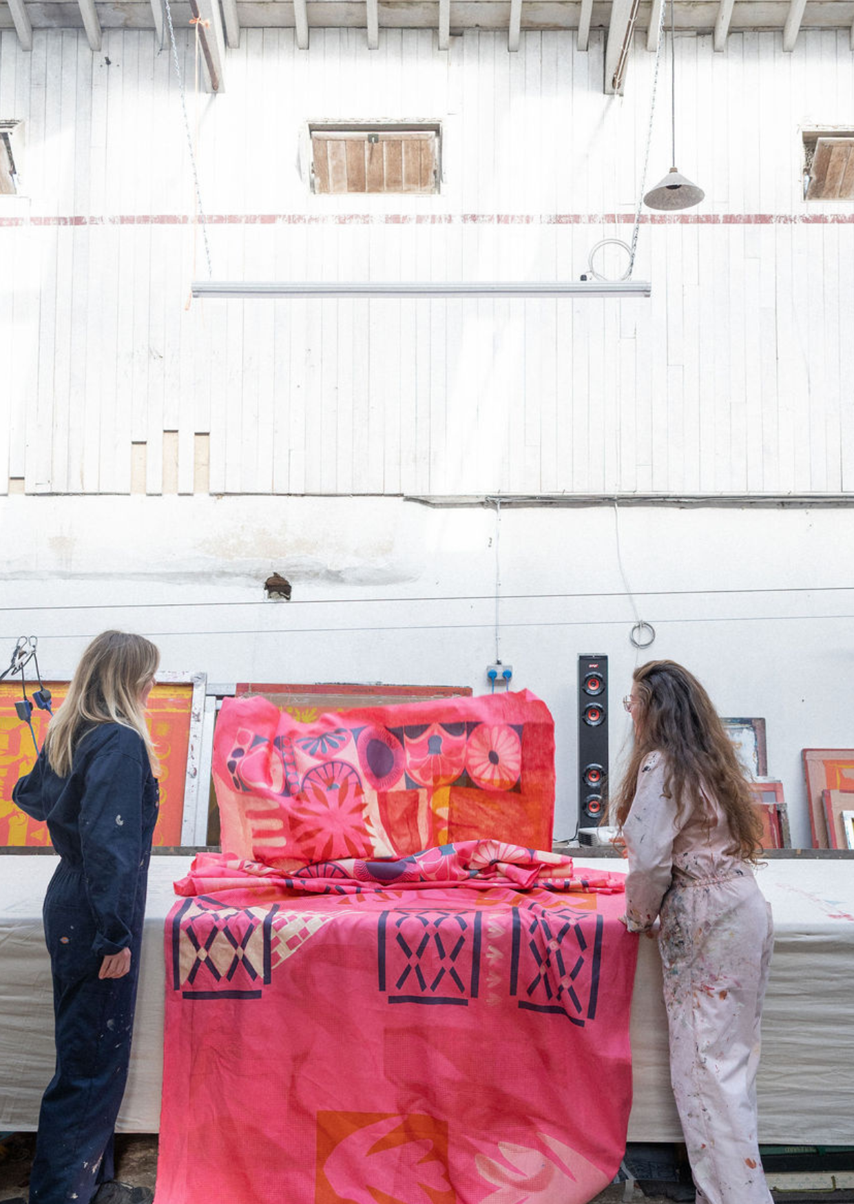
Summer is in full bloom, which means Jessie de Salis’ Somerset farm studio is calling for our Screen Print & Sew Retreats again! I always look forward to this time of year - these retreats definitely feel like a fun challenge as a teacher. There are lots of variables and so many different creative pathways each student can take, so it keeps us on our toes. It’s definitely an ambitious premise for a three-day workshop: to design and screen print fabric, before turning it all into a garment from scratch. So as teachers we want to make sure we are setting our students up to succeed, learn lots, and thoroughly enjoy the process along the way.
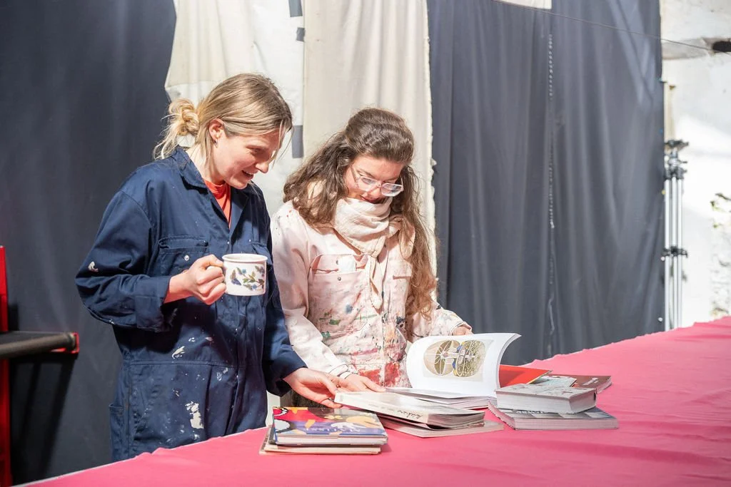
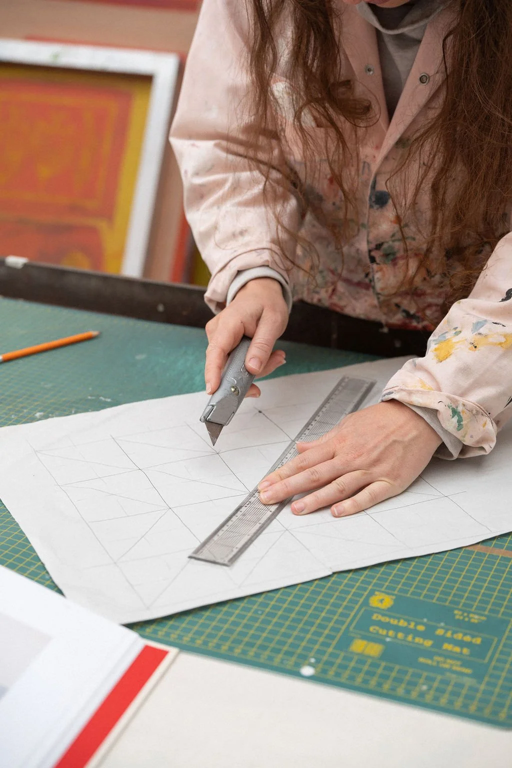
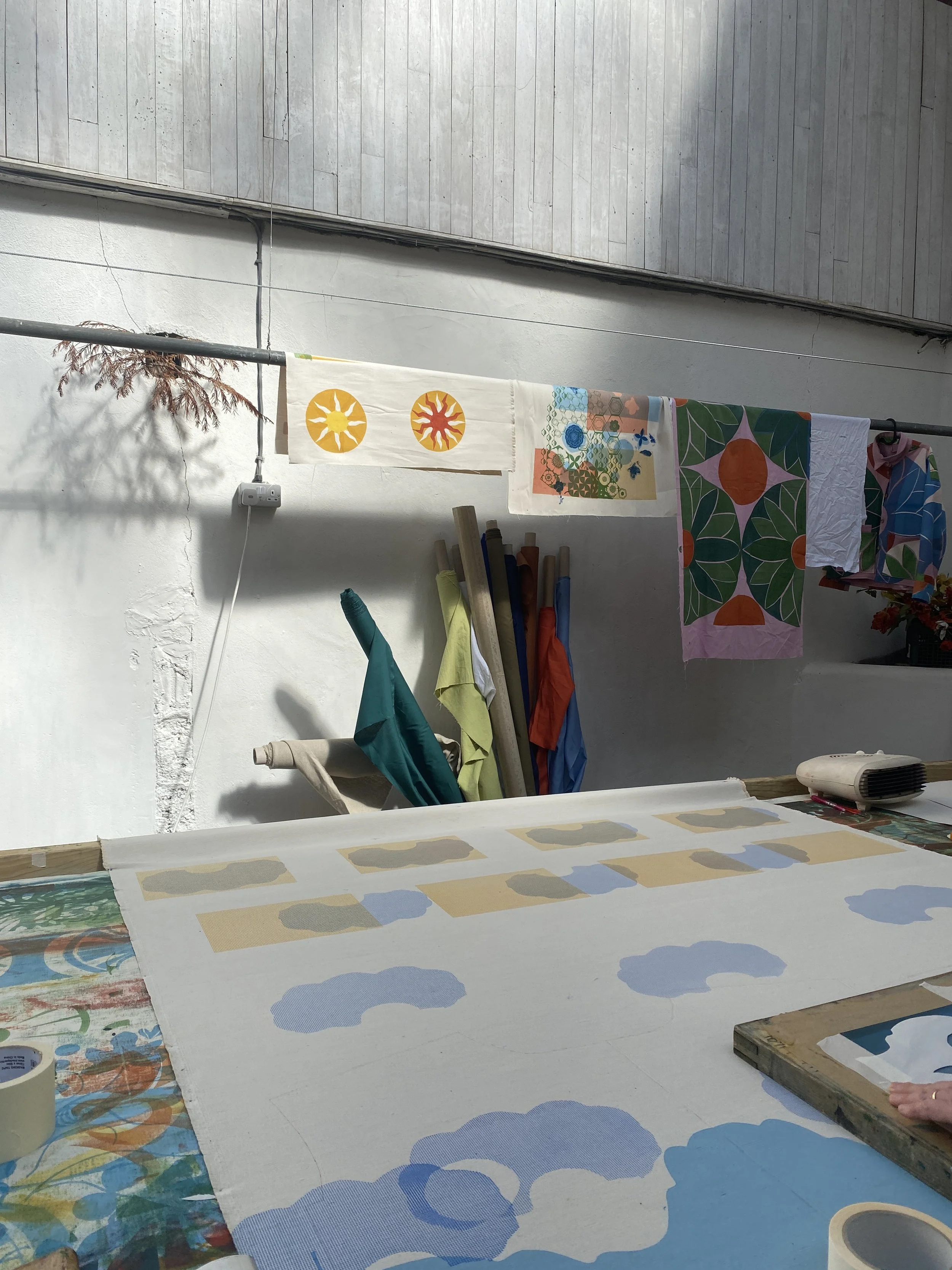
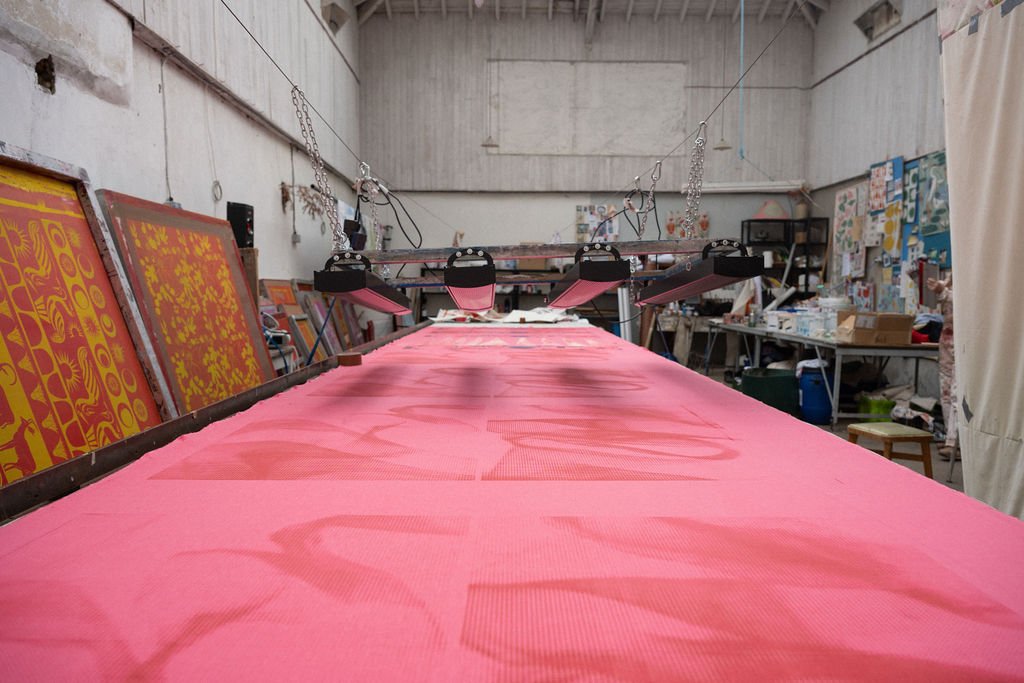
We’ve taught this retreat seven times before, but we are always wanting to improve and refine what we offer. So we got together this Spring to really interrogate the process of explaining and demonstrating the printing in a way that makes sense to you all. Then, of course, we gave ourselves a morning to play around with lots of screen printing techniques. We tested out everything from the thickness of the paper, to the type of the craft knives we use to refine the process.
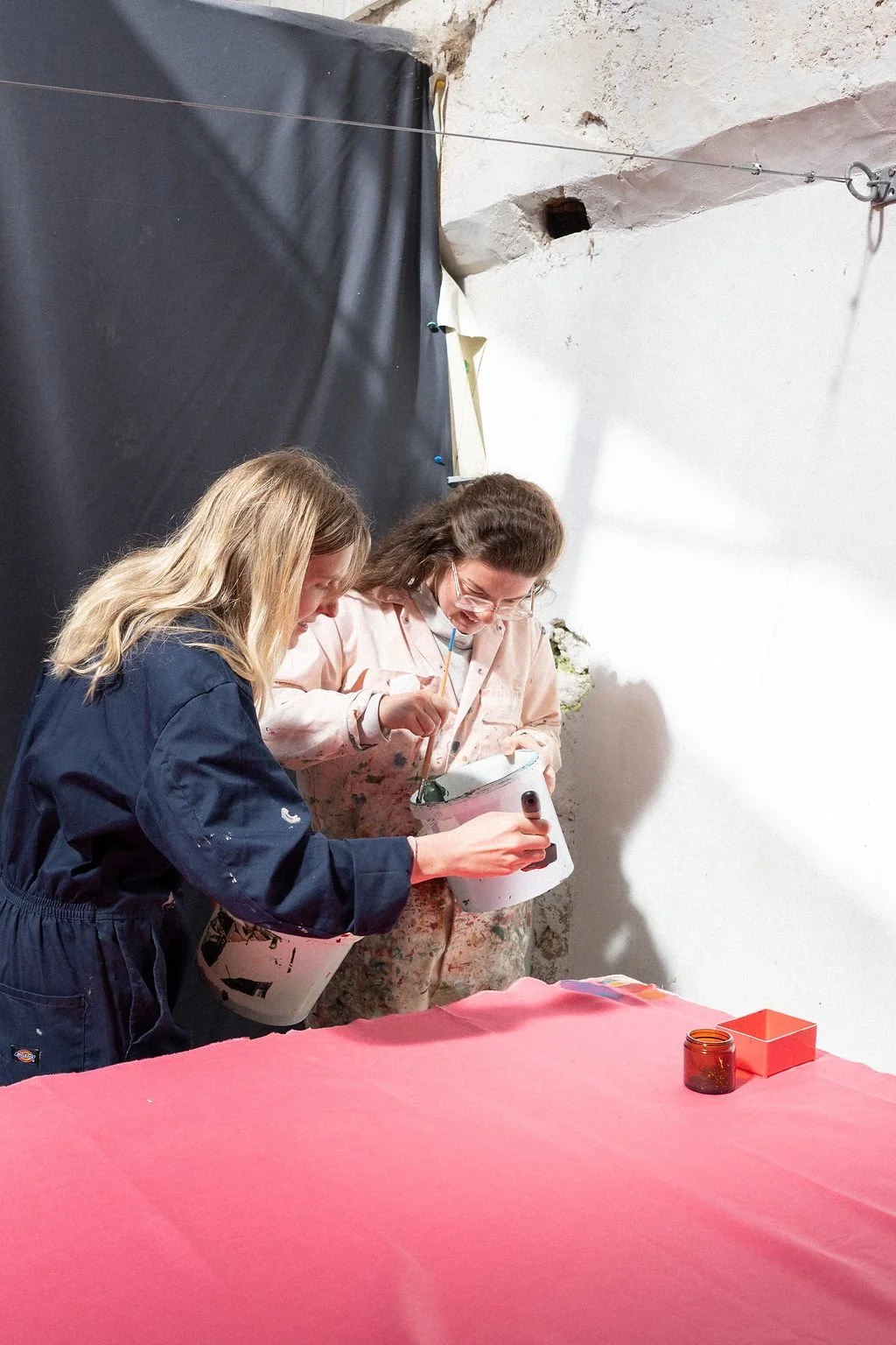
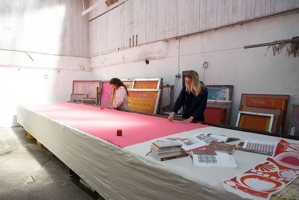
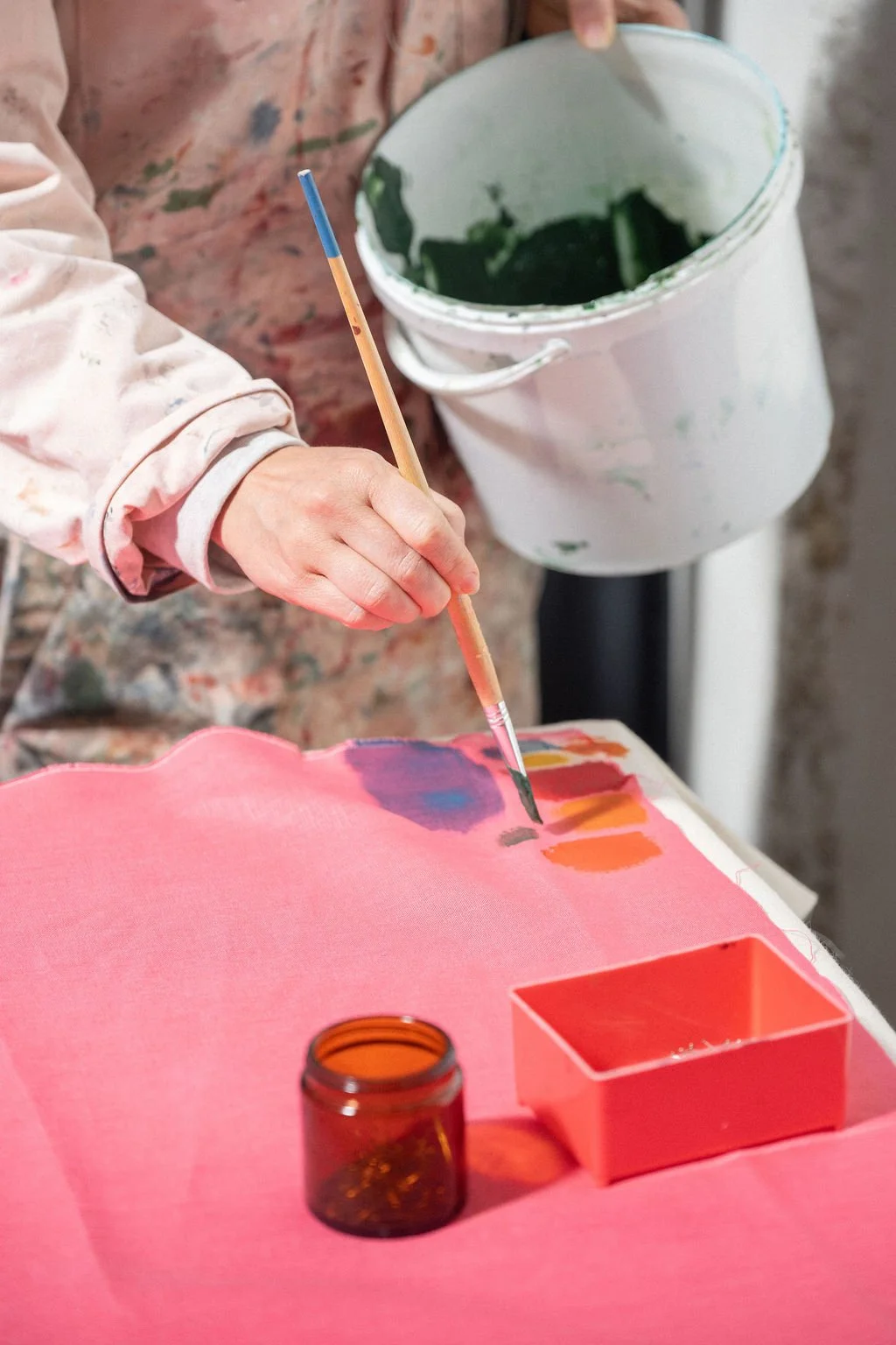
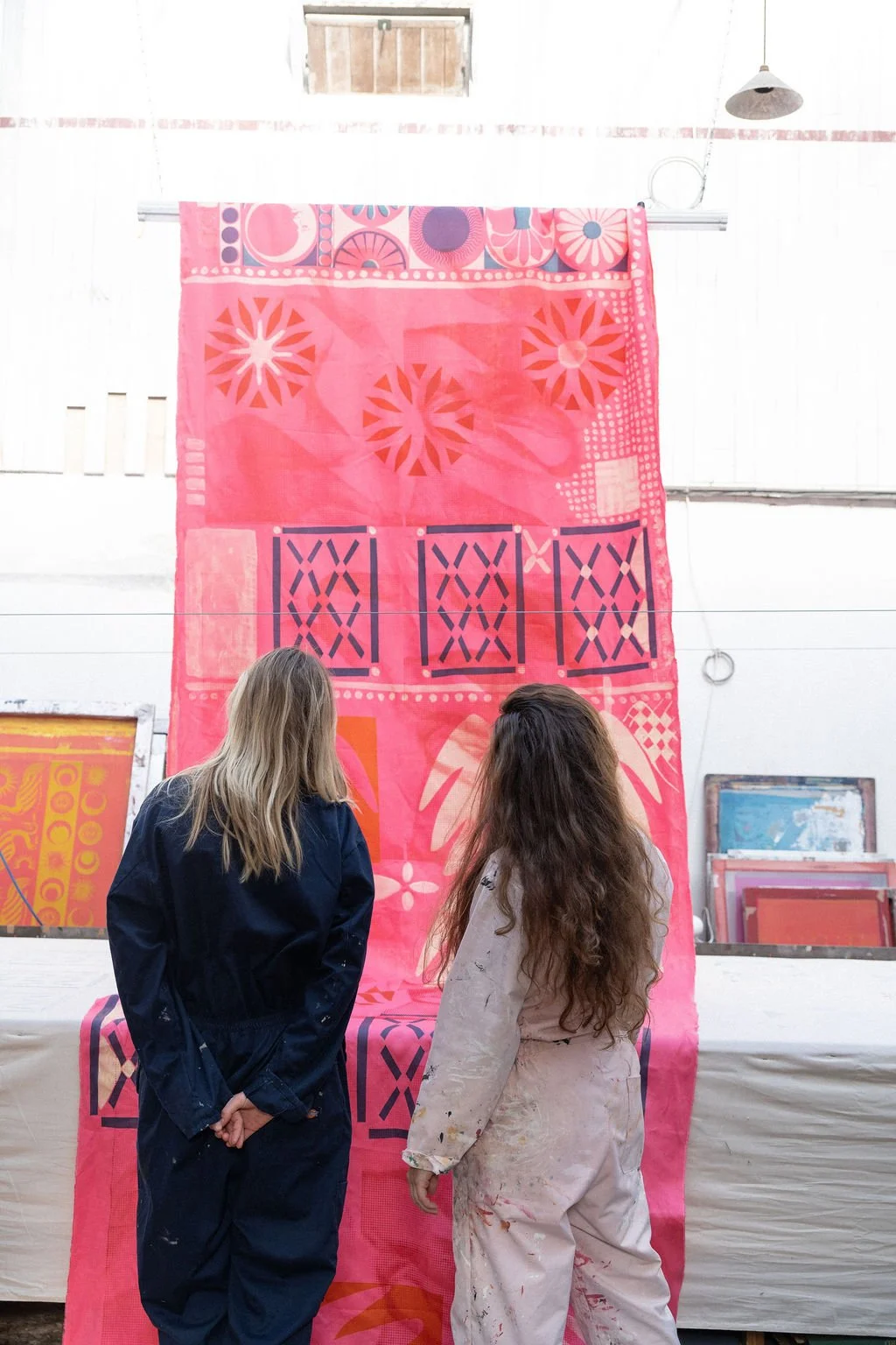
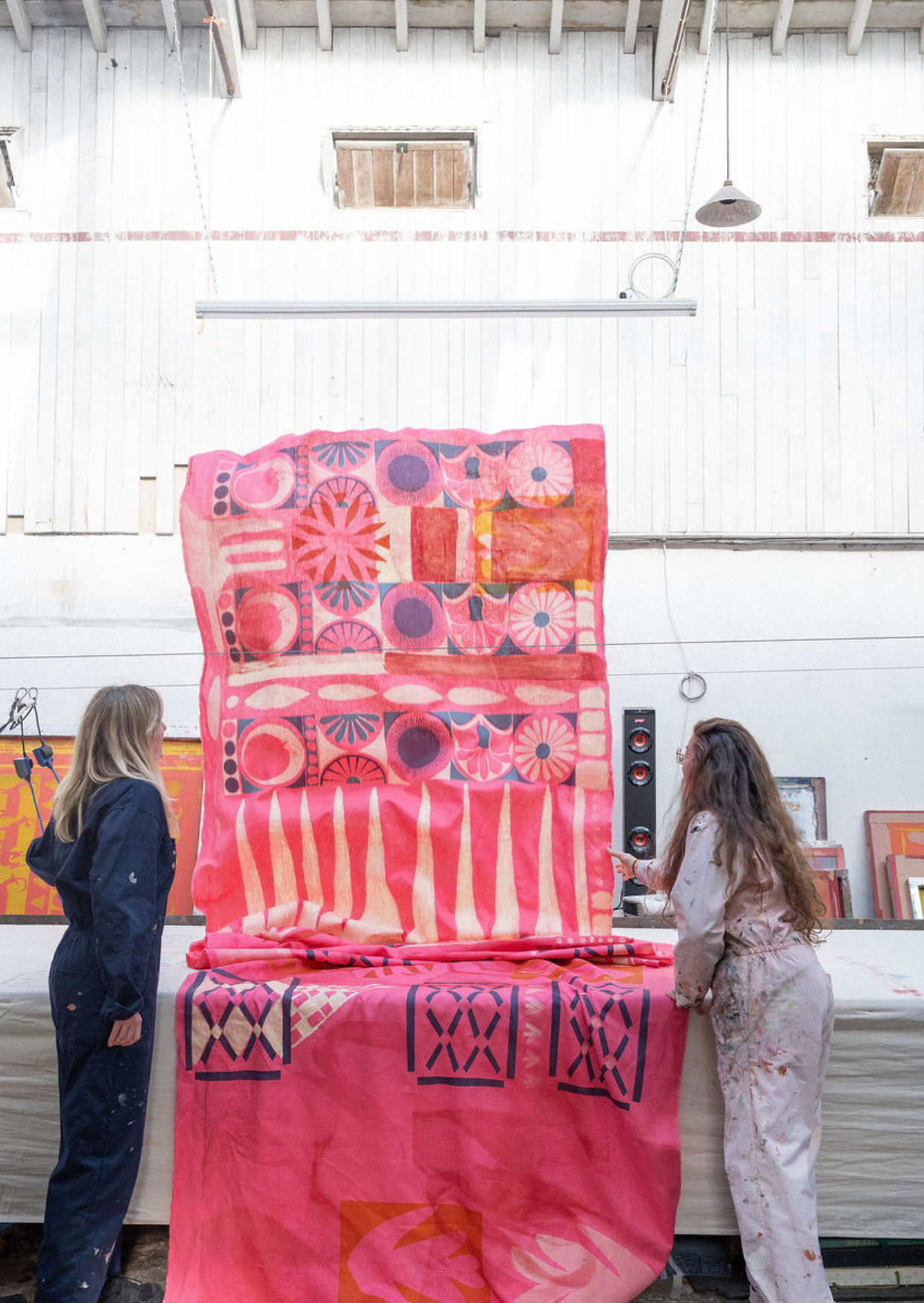
I had been kindly sent some coral pink linen from Fabric Wholesale Direct (but I would call it more of a hot pink). The quality of the linen is lovely and smooth with minimal slubs, making it perfect for screen printing on. So with this big pink blank canvas all laid out on the table, we started playing with lots of techniques, without being too precious about the results. This was our version of making a scrap book of ideas.
This process has helped us establish six techniques we think are a great place to start when designing and printing your own fabric…
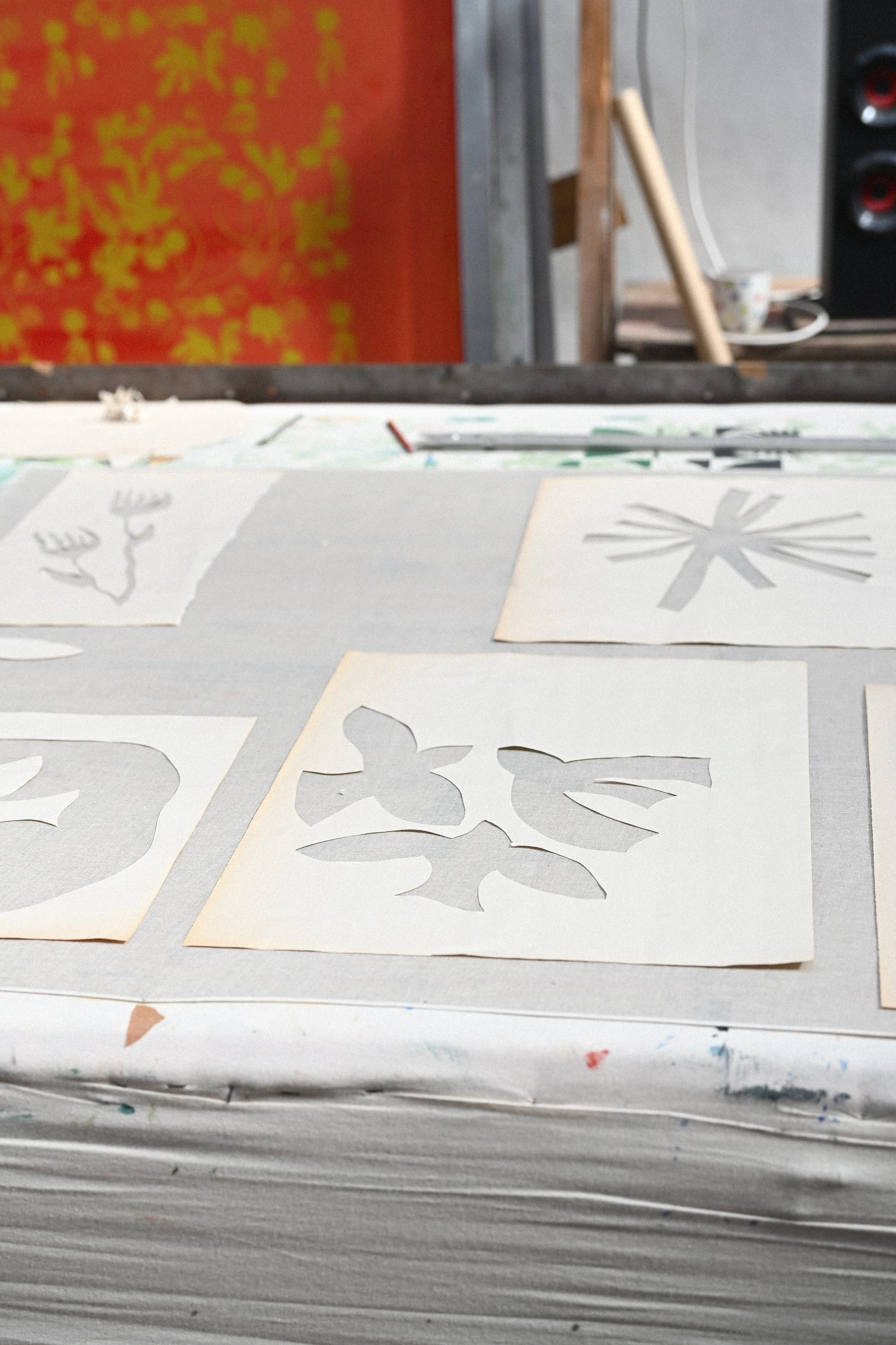
Top Tip Number 1: Use both the internal and external shapes of the stencil
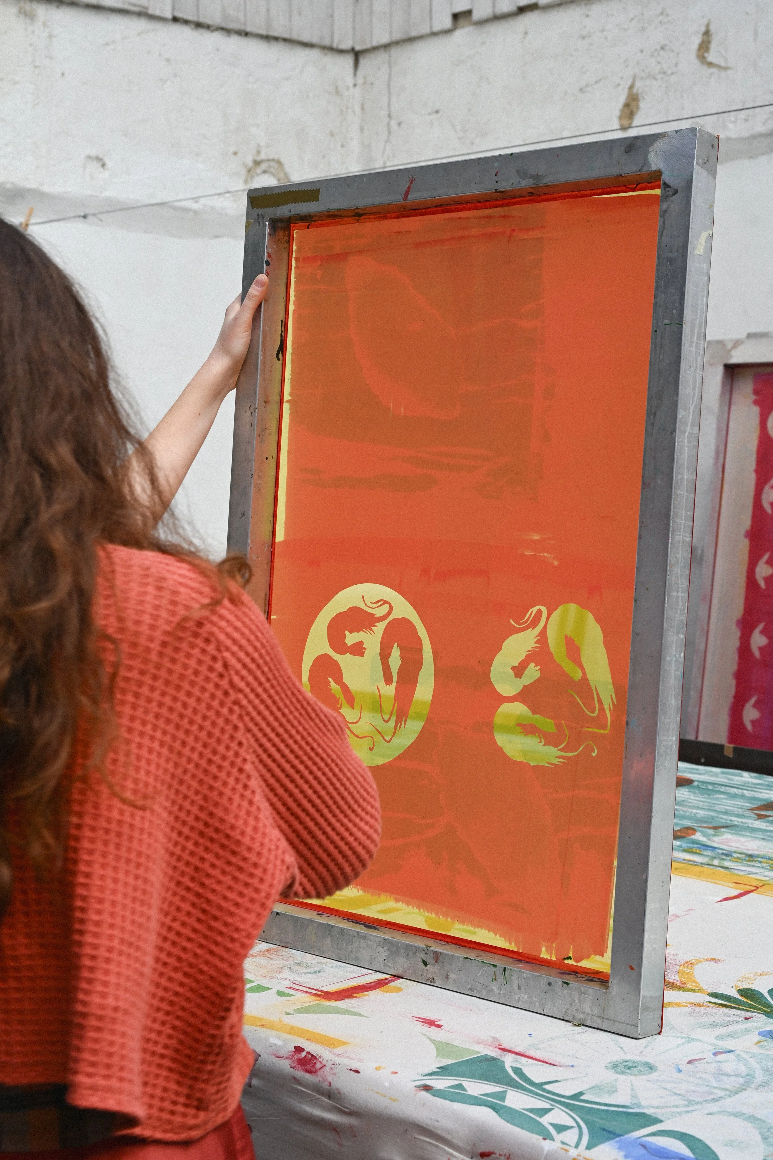
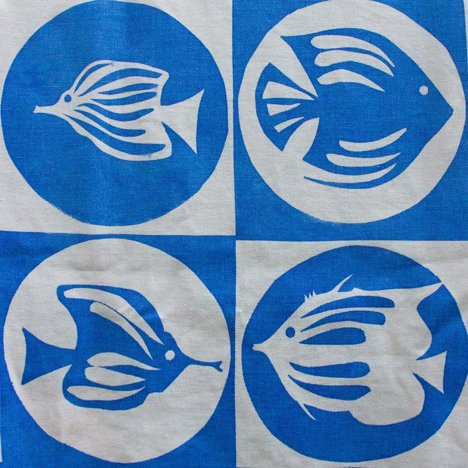
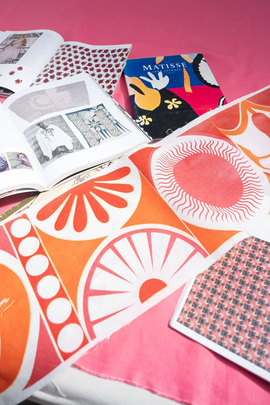
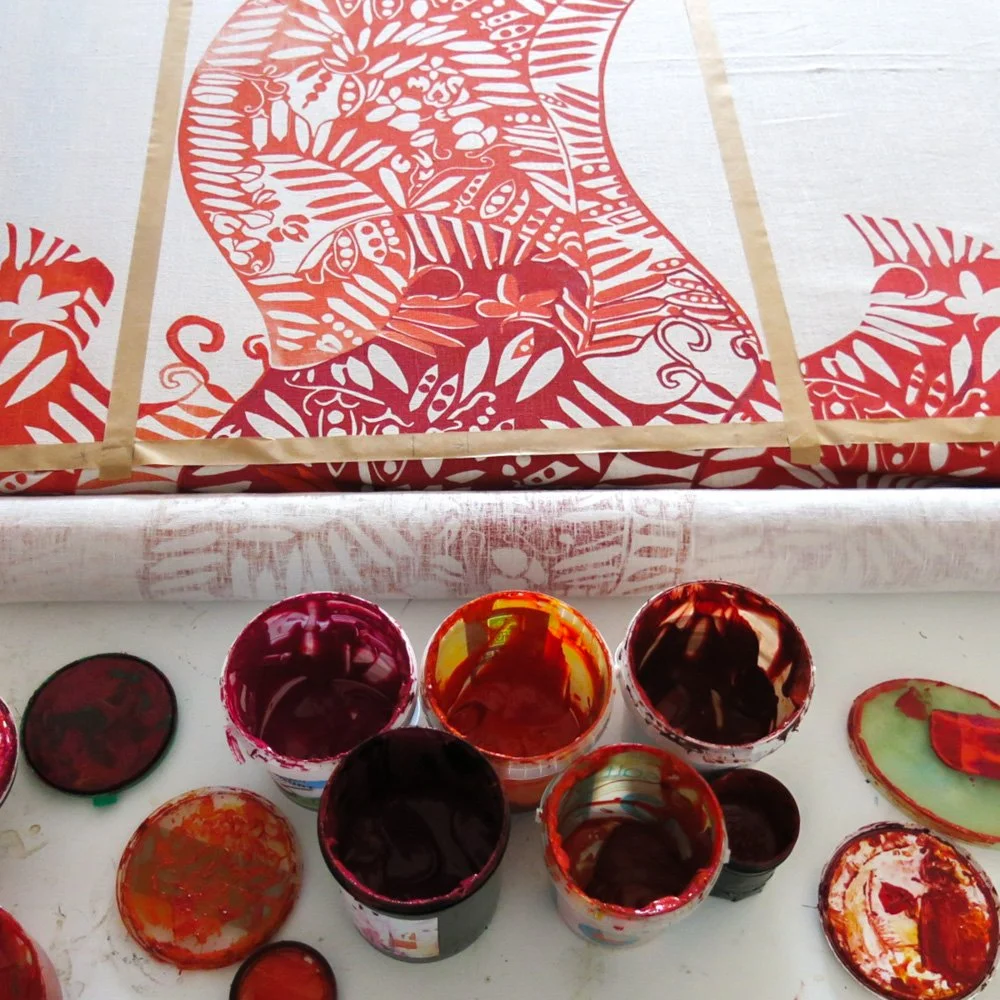
In screen printing, playing with shapes and patterns can be done by creating paper stencils. This style is great for a Matisse-like effect, since you can use big playful motifs in a choppy, expressive style. When you cut a shape out of paper (for example a fish) you will get both the shape of the fish and the outline of the fish on the background. You can use both parts of the paper stencil to create positive and negative images of the fish. It's an interesting way to develop a pattern that feels balanced and interesting for the eye to land on.
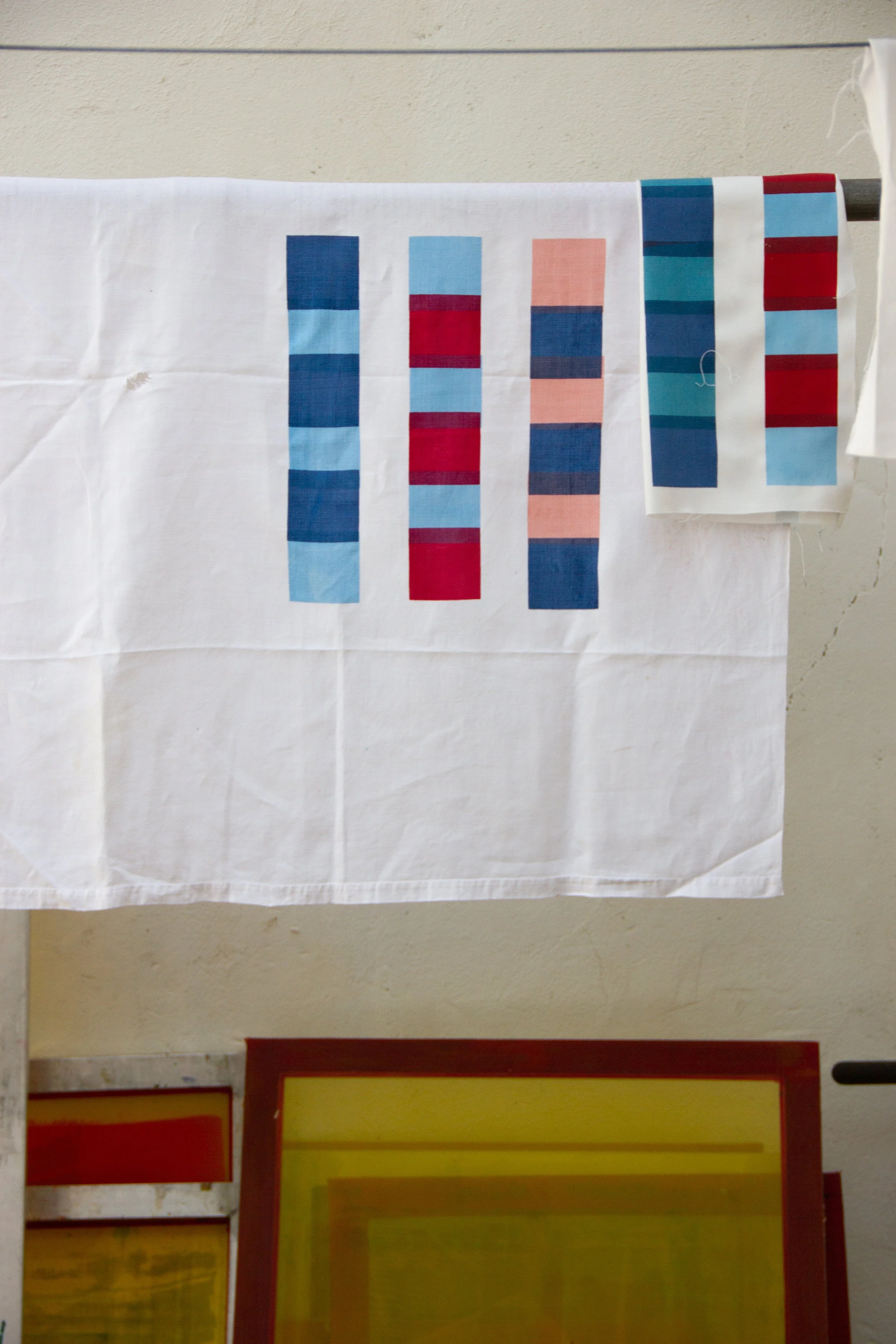
Top Tip Number 2: Stick to a colour scheme you love
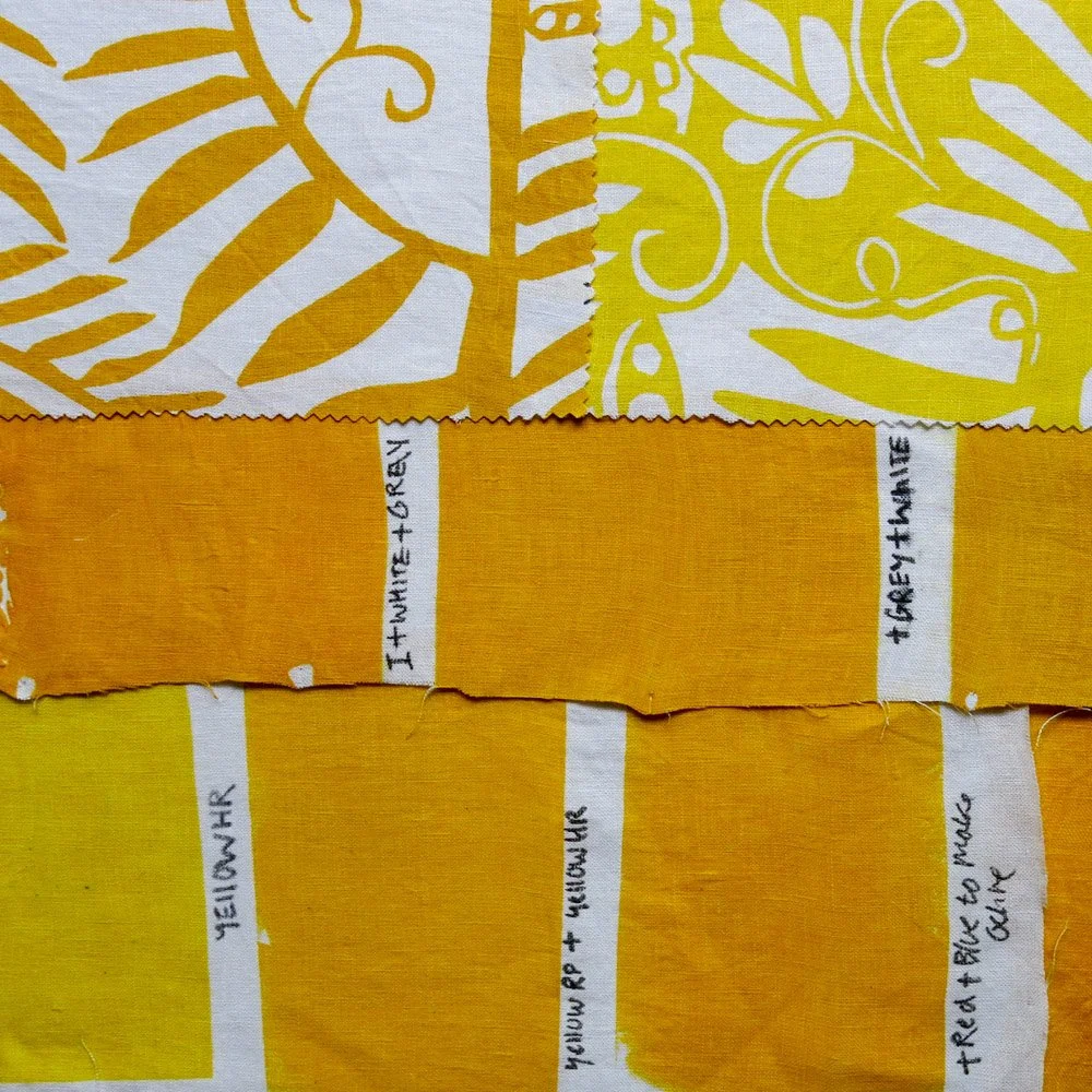


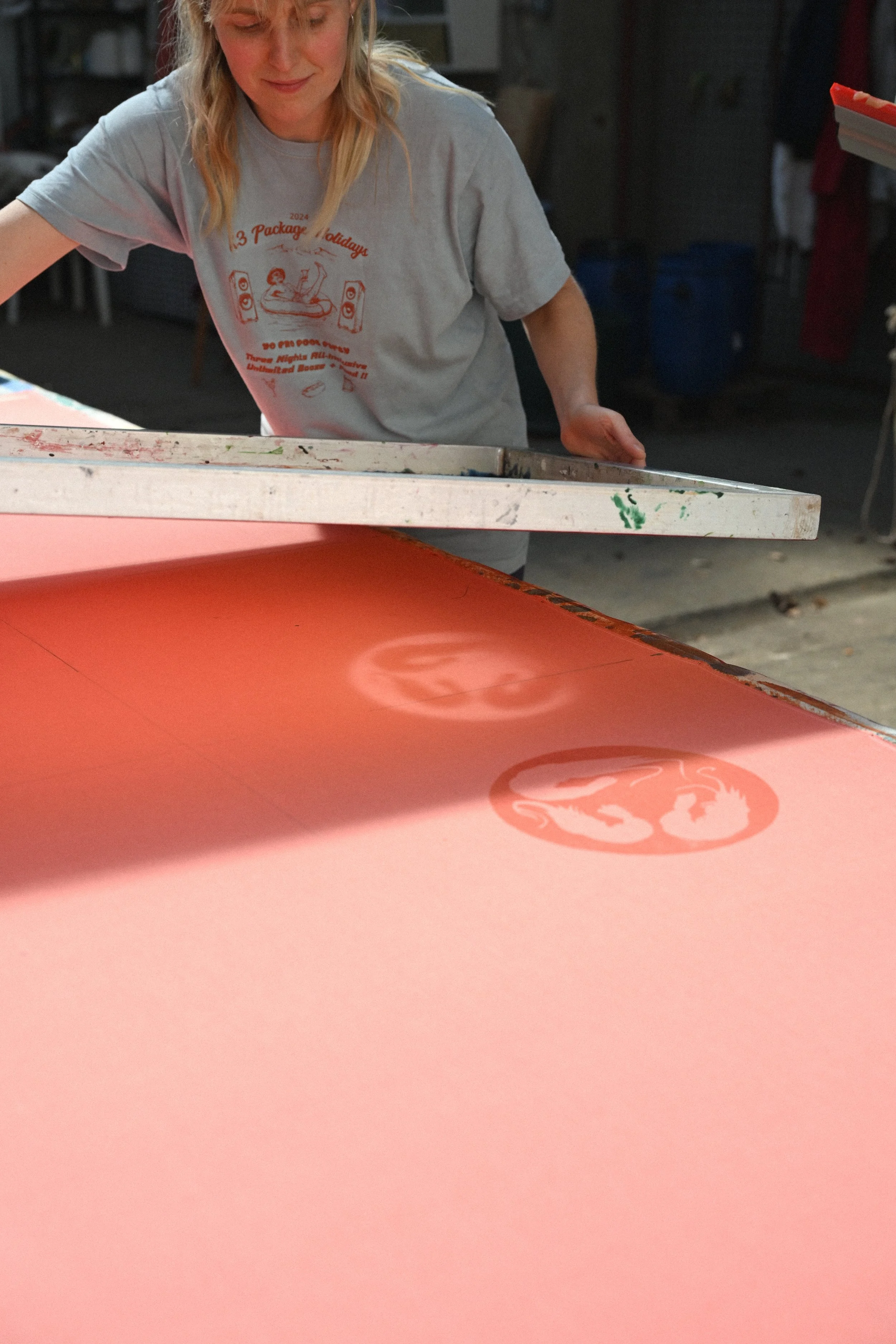
We really recommend spending a bit of time getting your colours right. We have found that three to four colours often looks the best. Any more than that can get a little messy. Paint swatches of different colours you like and see how they work together. It's interesting to see how a dark pink printed on a white will really stand out, but on a light pink base cloth it will look quite subtle.
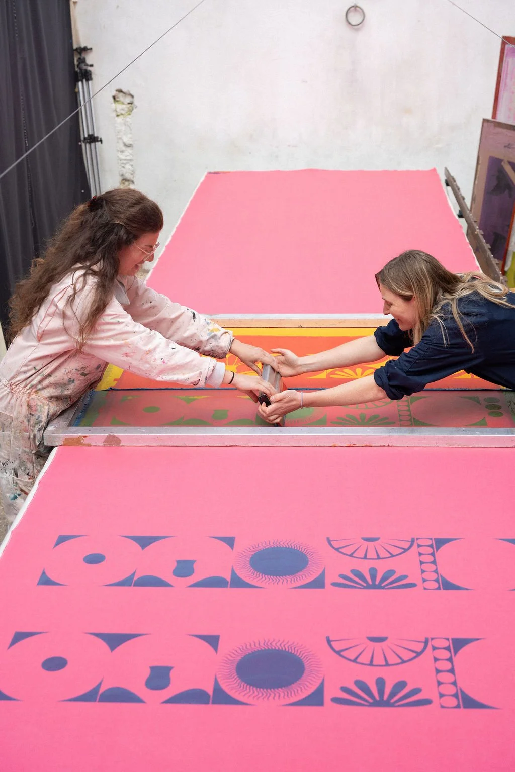
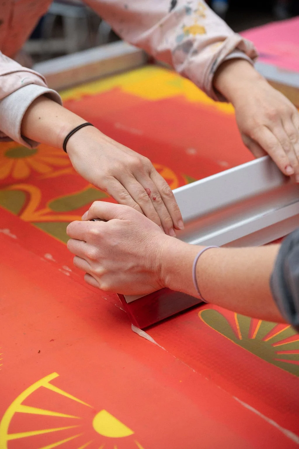
Top Tip Number 3: Balance big shapes on a screen with smaller details painted on afterwards
We often find the larger shapes look best when made into clothes. Bold shapes are also easier to cut out of paper and put onto a screen. You can then go in afterwards and add any more intricate detail with a paintbrush.
Top Tip Number 4: Removing colour from the fabric can create a lovely contrast between shades

Illuminating inks are great for taking the colour out of the dyed fabric, working like a bleach. The ink is made from natural dye ingredients and looks amazing painted or printed onto darker fabric. When you add the illuminating inks to a brightly coloured base cloth, you add contrast and a softer tone.
Top Tip Number 5. Remember negative space is your friend (especially when making clothes out of the fabric later on)
One thing we always tell our students is that you don’t need to cover every inch of the fabric with screen printing. This isn't a curtain, bedspread, or painting. We are working with fabric that will be chopped up and played around with. We have found that the garments that work best often have at least a third of the fabric left unprinted. This gives the print room to breathe and makes garments look more artistic and unique. So when you start to print on your fabric, remember this is just a stage in the process, not the final thing. If it helps you to visualise the pattern placement, you could draw around your sewing pattern onto the fabric first, so that you can see where different aspects of the screen printed design will end up on the body.
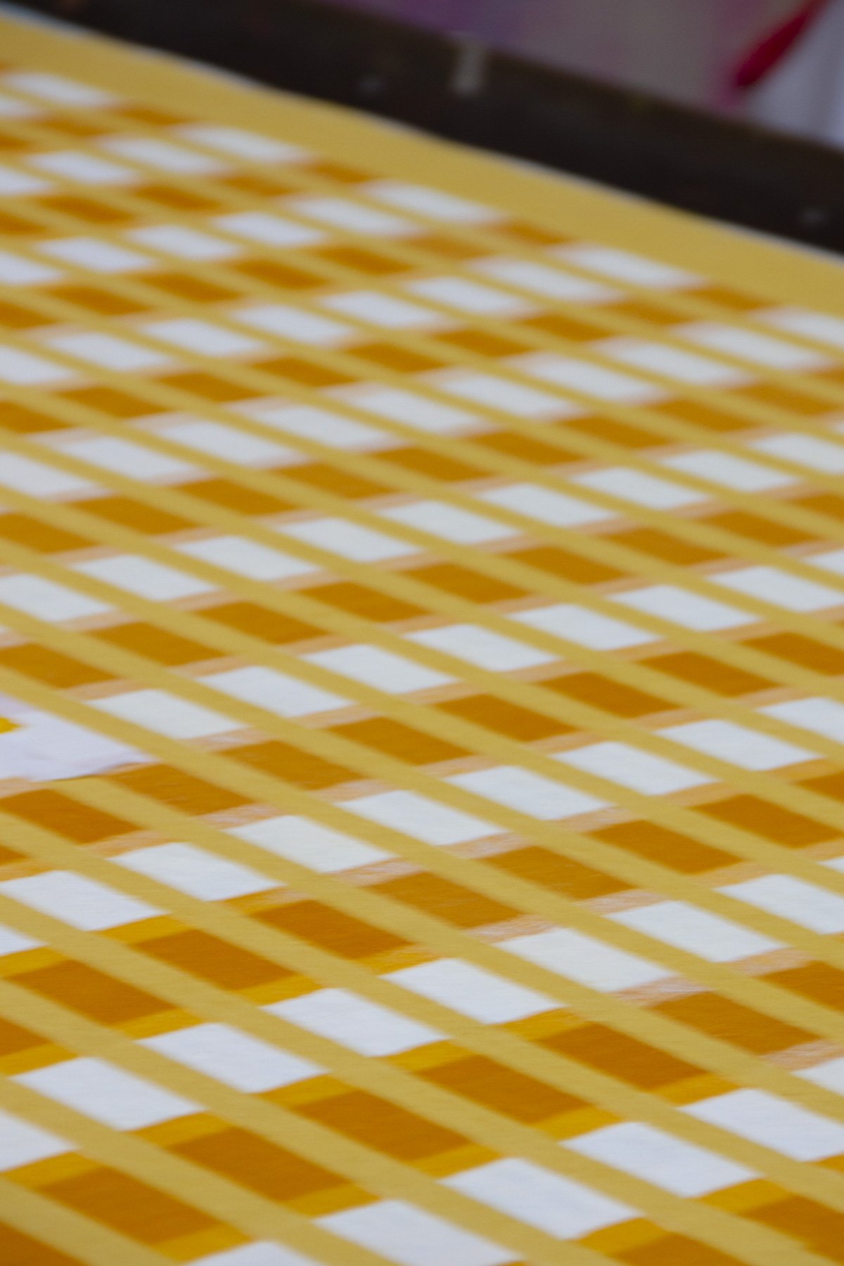
Top Tip Number 6: The magic of half tones!
Think Roy Lichtenstein, lots of tiny dots. This is a really soft and interesting way of adding subtle colour and texture. For example, if you wanted to take out the bright whiteness of your fabric, printing with a half tone still feels like adding detail, but softly adds a contrasting layer of colour too.


All of our Screen Print & Sew Retreats for 2026 have sold out, but if you would like to hear about new dates for 2027 we recommend signing up to our mailing list to get notified first…
With Thanks to Jessie De Salis and Ana Clark for the photography